McDonald's makeover: Is fast food slowing down?
Loading...
Taking a cue from Starbucks, which saw phenomenal success in the past two decades after creating what sociologists call a "third place," McDonald's has announced that it will be spending some $1 billion on a revamp of its stores, in an effort to get customers to linger after downing their last McNugget.
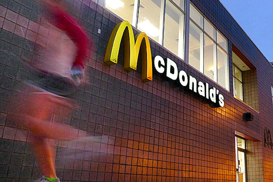
Gone will be the iconic fire-engine red that has graced the company's 30,000-plus restaurants. In 800 US stores this year, it will be replaced by a more mellow terra cotta. The yellow will become more of a mustard – not the mustard they serve at McDonald's, mind you. Instead, think Grey Poupon. On the walls will be fewer cartoon characters, and more contemporary art and photography. There will be less fiberglass, and more wood and faux leather.
This, along with couches, armchairs, and free Wi-Fi, the revamped restaurants are all part of the McDonald's makeover. The aim is to make the restaurants places to spend an afternoon sipping McCafé Mochas and munching on Apple Dippers. Or so McDonald's executives hope.
A front-page story in Monday's USA Today details the McMakeover:
•Redoing roofs. The bright red roofs that have topped McDonald's for several decades are getting the heave, replaced with flatter, more conventional roofs.
•Muting paint. The neon yellows and reds common to the interiors and exteriors are becoming history, replaced with much more subtle oranges, reds, yellows and even greens.
•Nixing fiberglass. The familiar fiberglass tables that have been a mainstay are being replaced mostly by wood.
•Updating chairs. Those industrial steel chairs are giving way to wooden chairs, colorful stools and, in some cases, vinyl-covered chairs that resemble leather. Some stores will have larger lounge chairs similar to the kind you might expect to find in a coffee shop.
•Doubling drive-throughs. To ease lines inside and outside stores, many locations are adding second drive-through windows to speed up service.
•Splashing color. McDonald's hasn't junked it's familiar red and yellow colors altogether, but it is making them far less obvious. Instead of filling the restaurants with them, it's splashing bright yellow and red here and there for effect.
•Junking the fluorescent look. Overhead fluorescent lights are being replaced with more contemporary lamps that make the lighting in stores look less like that of offices.
•Dividing dining areas. The sea of tables and chairs is history in the remodeled stores. The new dining rooms are divided into separate eating zones for larger groups, eat-and-run customers and folks who want to stay and lounge.
•Adding flat-screens TVs. Large, flat-screen TVs — some playing contemporary music — are showing up in many locations, though fewer than half of the remodeled stores will display them.
•Erecting semi-swooshes. Curving across the top of the newly flattened roof is what McDonald's calls the yellow "brow" — or half of a golden arch. It's got the familiar, bright-yellow design but encased in a Nike swoosh-like arc.
Will these changes entice you to spend a few hours in a McDonald's? Let us know in the comments.


