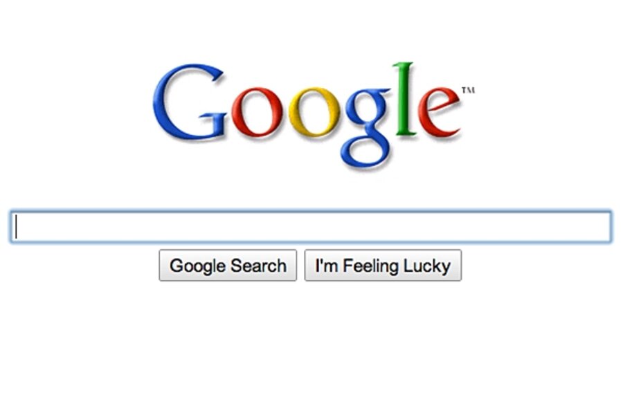
Google settles on new fade-in homepage
Loading...
As winter curiously fades (it's 69 and sunny on this December afternoon in Boston) so, apparently, do things over at the Google homepage.
Google Vice President of Search Product and User Experience Marissa Mayer writes in a post today that the company has decided on a new, cleaner design for the iconic Google homepage:
The main feature of the new homepage is that it "fades in" — when the page first loads, it shows only our logo, the search box and the buttons.
As we told you back in October, Google has been experimenting with various homepage designs – from just a search box and logo, to the same with "This space intentionally left blank" below it.
The final design (and, as we know on the Web, nothing is final) is aimed at giving people exactly what they're looking for:
For the vast majority of people who come to the Google homepage, they are coming in order to search, and this clean, minimalist approach gives them just what they are looking for first and foremost. For those users who are interested in using a different application like Gmail, Google Image Search or our advertising programs, the additional links on the homepage only reveal themselves when the user moves the mouse. Since most users who are interested in clicking over to a different application generally do move the mouse when they arrive, the "fade in" is an elegant solution that provides options to those who want them, but removes distractions for the user intent on searching.
And that, there, is likely more information than you ever thought you wanted to know about Google's search page design.
––
Like Google's new homepage? See something other than what Mayer describes? Leave a comment or connect with us on Twitter – we're @CSMHorizonsBlog.


