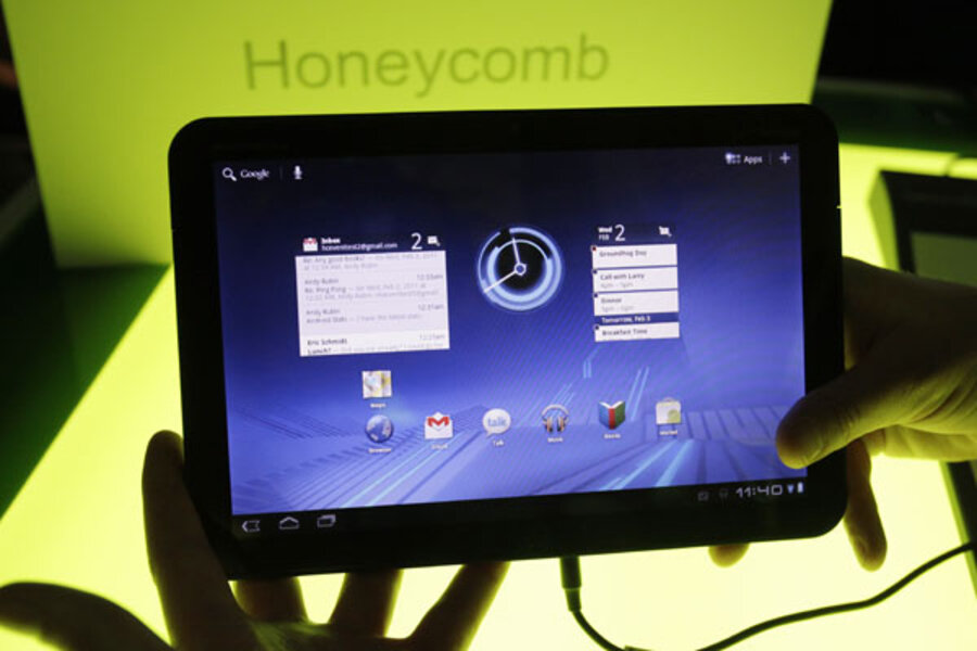
Motorola Xoom review roundup
Loading...
Motorola Xoom hits store shelves this week, and not exactly for a budget price – consumers can shell out $800 for an unsubsidized Xoom or $600 for a Xoom and a two-year Verizon data package. But then again, this isn't a lightweight machine: The Xoom is powered by the Android 3.0 Honeycomb OS, and comes equipped with 1-GHz dual-core Nvidia Tegra 2 processor, a 10-inch HD display, and a pair of cameras.
So what do reviewers have to say about the Xoom?
Let's start with the device itself, which is apparently a little overweight. "A lift with an index finger takes a surprising amount of strain," writes Andrew Nusca of ZDNet. "It may be just a half-inch thick in the center, but at 1.6 lbs., it weighs in as heavy as a paperback copy of James Joyce’s Ulysses. (Imagine hauling that back and forth to the office.)" Indeed. The screen on the Xoom clocks in at 10.1 inches, just a smidgen bigger than the iPad.
ALSO SEE: 10 most intriguing tablets of 2011
Kevin C. Tofel of GigaOm reports that the back of the Xoom "is slightly rubberized and offers more rounded corners than found on the iPad: a good thing to my hands. The only sharp edges are around the display." But Tofel worries that some users will find the bezel on the Xoom "too thin. Even my small fingers only just fit and on a few occasions, I’ve unintentionally tapped the screen when I thought I was touching the bezel."
On to the lenses: The Xoom ships with a back-facing 5-megapixel camera and a front-facing, 2-megapixel version for webcam conversations. Wired reviewers Michael Calore and Dylan Tweney say "taking pictures with [the Xoom] feels funny. It’s the same as snapping a picture [on] your phone, except the thing you’re holding is four times the size."
But there are a bunch of pluses. "[Being able to compose a photo while looking at something bigger than a 5x7 print is a real luxury," the Wired team notes, "as it lets you see details you wouldn’t otherwise notice on a small phone screen or camera viewfinder. It’s awkward, but we suspect it will become commonplace within a few months, now that every tablet is getting a camera built into the back."
How about that much-vaunted Android 3.0 Honeycomb software? Well, CNET calls Honeycomb sophisticated and complex.
But CNET reviewers argue that the "complexity and sophistication is a double-edged sword." On the Xoom, "A task as simple as opening the lock screen plays out like an IQ puzzle.... There will be users who are going to rejoice in the flexibility and options on offer by Honeycomb, but there are bound to be just as many who are turned off by the complexity. We're just thankful that users now have more options when it comes to tablets," CNET reports.
We'll give the last word to Joshua Topolsky at Engadget. Topolsky's review isn't a total pan – he liked some parts of the Xoom – but neither is it a rave. "The problem with the Xoom isn't really about the core of the experience or the core of the hardware – it's about the details," he writes, citing "wonky buttons" and software that feels like it is "very much in beta."
Was the Xoom pushed out too fast, in an effort to beat Apple, he wonders? "Regardless, there isn't much here for consumers right now," Topolsky concludes. "The Android Market is almost devoid of tablet applications, the OS feels buggy and unfinished, and the hardware has pain points that we find troubling. And that's to say nothing of the pricing and carrier commitments being asked of first-time buyers."
For more tech news and reviews, sign up for the free Innovation newsletter, which is emailed out every Wednesday morning.


