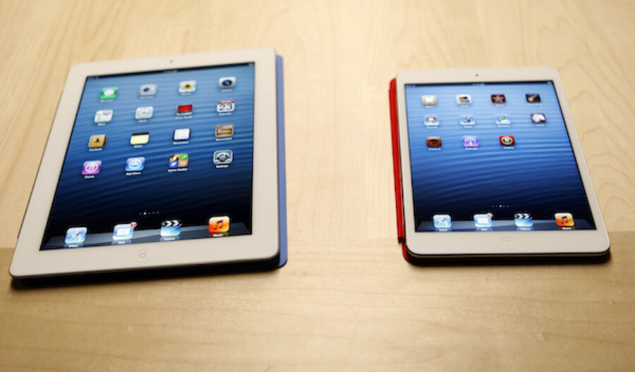
iPad Mini review roundup: slim shape, sharp lines, sub-par screen
Loading...
On Friday, Apple will begin selling its long-awaited iPad Mini – a pared-down, super-slim tablet with a 7.9-inch display and an A5 processor. The Mini starts at $329, for a 16GB Wi-Fi-only model; 4G LTE-capable versions are set to ship in early- to mid-November. Reviews of the new Apple tablet begin to leak out today. So what kind of device is the iPad Mini, exactly?
Well, let's start with the obvious: The size. As Harry McCracken of Time notes, the Mini is 0.28 inches thick and weighs just 0.68 pounds.
"That’s not just a drastic reduction from the large iPad, which weighs more than twice as much, it’s also trimmer than Apple’s smaller-screen competition," McCracken writes. "One of the persistent gripes I hear from iPad skeptics is that the existing models are too big and bulky to hold comfortably; if there were an industry award for Tablet You Can Most Easily Envision Holding for Extended Periods of Time, the Mini would be a runaway winner."
Shane Richmond of The Telegraph, in the UK, agrees, calling the Mini "the best looking tablet computer anyone has designed."
Ever!
"There are plenty of people who care nothing for how a gadget looks. The specificationists are more interested in processor cores, USB ports and whether they can root their operating system. That's fine," Richmond writes. "They'll be unmoved by the sleek metal back and the chamfored edges of the iPad mini. Nevertheless, this is a device that looks and feels great."
Of course, there is such a thing as too thin, writes Joshua Topolsky of The Verge.
"I actually had a little trouble holding onto the device when I wasn't using the Smart Cover due to the back being as smooth as it is, and the frame being so thin. Maybe it's just my big hands, but I wanted a little more to grab onto. In that regard, I prefer the feel of the Nexus 7," he notes. "That problem was exacerbated by how wide the device feels in your hand, as well as the lack of a significant bezel around the left and right of the screen in portrait."
Now on to the screen. Keep in mind that as opposed to the Kindle Fire HD, which retails for just 200 bucks, the iPad Mini does not include a high-resolution display. That hasn't escaped the notice of the Wall Street Journal's Walt Mossberg.
"Apple insists the device does better than standard definition, if you are obtaining the video from its iTunes service, since iTunes scales the video for the device, so it will render somewhere between standard definition and HD," Mossberg writes. "It says some other services will do the same. But the lack of true HD gives the [Google Nexus 7] and Fire HD an advantage for video fans. In my tests, video looked just fine, but not as good as on the regular iPad."
Meanwhile, over at Bloomberg, Rich Jaroslovsky addresses a question we've had on our mind, too: Is 7.9 inches really enough screen space?
"I didn’t see a huge difference [between 9.7 inches and 7.9 inches] in some uses, such as watching videos or reading e-books. But I found it noticeably harder to read some Web pages, particularly those with fine print. If you’ve got eyesight at all like mine, be prepared to do a lot of pinching and zooming," Jaroslovsky says.
We'll give the last word to Scott Stein of CNET, who takes stock of the hardware on the iPad Mini.
"The venerable dual-core A5 processor has been around since 2011, and has been seen in everything from the iPad 2 to iPhone 4S, fifth-gen iPod Touch, and Apple TV. The version in the Mini most closely matches the iPad 2's, with the same 512MB of RAM," he writes, adding that "the iPad Mini is really a shrunken-down, redesigned, enhanced iPad 2."
And that's not a bad thing at all.


