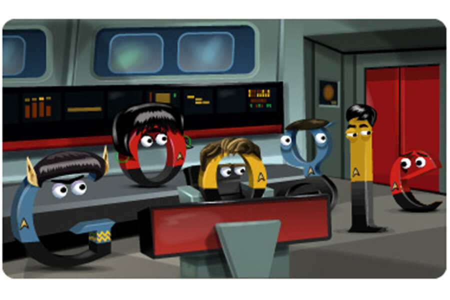
Welcome to the bridge, where so much of Star Trek: The Original Series takes place. Forgive appearances – the crew is not quite itself today.
Google swapped out our usual heroes for a band of alphabetical stand-ins. You may recognize the capital G as Mr. Spock, complete with pointy ears and thick eyebrows. Next, we have O playing the roll of Lt. Uhura, chief communications officer. Standing boldly in the center is Captain Kirk, with his blonde coif in perfect order. Filling out the right flank are Dr. McCoy, Sulu, and a nameless redshirt (more on him in a moment).
As Google designer Ryan Germick points out, few TV shows have such iconic characters that you can identifying them based solely on these cartoon features.
"We went through lot of different iterations," Mr. Germick told EW. "What we’re looking to do is show them. And it seemed like a way to double-down sort of silly, campy nature of what we’re doing with the doodle to put in Kirk’s block of hair, Spock’s ears. It’s a testament to the power of the show, and how iconic it is, that you can just put a couple details on anything, even a letter ‘G’ and know it’s a Vulcan. That was really fun to play with and informs the whole direction of [the silly style]."
The Google logo seems uniquely suited for such a gag. Sure, the search giant has a history of making creative doodles. But think about the colors. Star Trek uniforms come in blue, red, and yellow. Google's logo comes in blue, red, and yellow. The doodle cheats a little by swapping out the usual green L for Sulu's gold uniform, but the hues otherwise match up one-to-one.
The doodle team had plenty of time to think this through. Germick says they've been brainstorming for "the past couple of years" and "started putting it together in earnest three or four months back."
This effort shine through once you start exploring the bridge. Click on Uhura for a lovely close-up. Bang on the console for classic sound effects. And tap the door to continue your space adventure.


