
How Saul Bass changed design
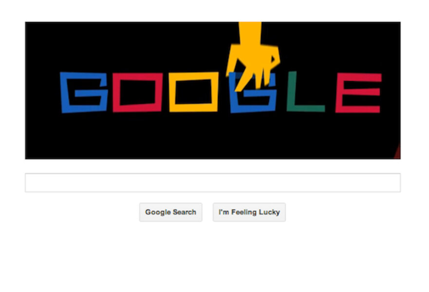

Google celebrated graphic designer Saul Bass with a doodle Wednesday.
It is only fitting that a brand praised for its sparsity tip its hat to the father of slick, simple corporate identities.
Mr. Bass created entire art forms from seemingly artless banalities. He gave projectionists a reason to draw the curtains for a film's opening credits. He breathed life into the sterile company logo.
Saul Bass did what great designers do. He surreptitiously moved people.
It's why Bass' legacy lives on today, long after his passing 17 years ago. Despite many companies abandoning his work in favor of flashier redesigns, it is hard to deny Bass's lasting influence on the clean icons and minimalist visual designs permeating tech culture today. He did to visual communication what William Strunk Jr.'s famous "Omit needless words" did to written expression.
"If it’s simple simple, it’s boring," Bass once said. "We try for the idea that is so simple that it will make you think and rethink.”
The notion that something as pedestrian as a brand could induce contemplation was a novel idea when Bass began working on logos in the 1970s. Employing deceptively plain shapes and lines, he created iconic logos for some of the world's most well-known companies – Kleenex, Alcoa, Quaker, Girl Scouts, AT&T, and many more.
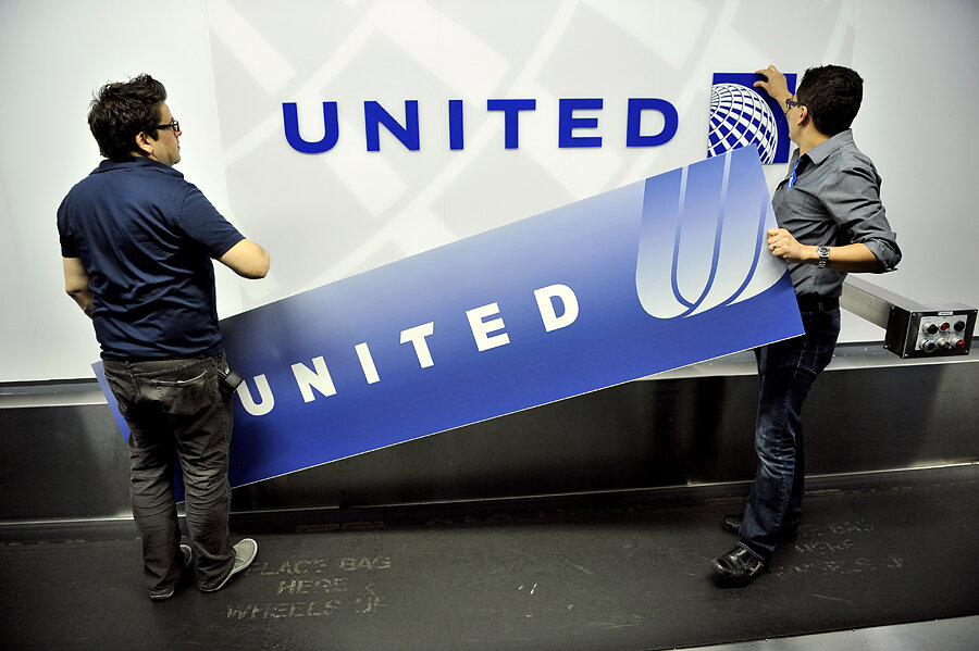
The swooshing logo he designed for United Airlines in 1973 is one of his best, and perhaps his most recognizable. The so-called "tulip" is remarkable in its visual efficiency – evoking movement, winged flight, the American flag, and the company's monogram all in one fell swoop.
Bass captures with four lines in red and blue everything the company aspires to be. That knack for making a whole exponentially greater than the sum of its parts is why his work endures.
When United hired design firm Pentagram to give the identity a facelift in 1996, the creative team was smart enough to recognize you cannot improve upon perfection.
"We were given an open brief when we began working with United," the Pentagram team recalls in an online retrospective, "but we made one decision shortly after we began: we elected to retain the remarkable logo created for them in 1973 by Saul Bass."
Such is the reverence for Saul Bass.
Still, it couldn't last. In 2010 United merged with Continental Airlines, keeping the United name but dropping Bass's logo. For visual identity, it opted to use Continental's bland, blue-and-white globe instead.
The design community mourned the loss.
"That elegant, understated U," wrote Fast Company. "Can we all pause for a moment of silence for that beautiful U?"
"[I]t’s impossible to see the new logo and not feel that there is something inherently wrong with this equation," wrote Brand New, a corporate identity blog.
The cherished tulip isn't the only Bass work to fade. His logos for Dixie, Quaker, AT&T and others have all been "updated" or ditched entirely. Most attempts to "refresh" or "modernize" these logos result in glossy 3-D imitations that somehow feel more dated than Bass's evergreen originals.
The redesigns can't take away from Bass oeuvre. He created identities for some 80 major corporations in his time. That's on top of the groundbreaking film title designs he did for famous directors such as Alfred Hitchcock, Stanley Kubrick, and Martin Scorsese.
“Design is thinking made visual," he is quoted as saying.
That philosophy resonates today in the bare-bones Apple logo, the inviting simplicity of Google's homepage, and the clean, touch-screen tiles of Microsoft's "Metro" redesign for the Windows Phone.
Steve Jobs, himself a champion of sparse design and typography, is said to have adopted as a motto, "Real artists ship."
If that's the case, then perhaps Bass – whose work and influence surrounds us at every turn – is the realest artist of them all.


