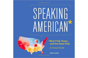
American speech mapped, in vivid color
Data cruncher extraordinaire Josh Katz has turned the responses he got to his fascinating online dialect quiz into a new book.

'Speaking American' is by Josh Katz.
Just when I thought I’d had enough of red and blue maps for a while, what should show up on my doorstep but a new book full of them: “Speaking American: How Y’all, Youse, and You Guys Talk: A Visual Guide,” by Josh Katz.
Let’s note, though, at this moment of postelection fatigue, that Mr. Katz’s maps aren’t only red and blue. Many are in shades of green and purple and orange as well.
Katz’s book maps word choices and pronunciations across the United States, complete with sections on “how to pretend you’re from” various places.
In 2013, Katz, a graphics editor at The New York Times, published an online dialect quiz that drew more traffic than any other page on the Times website that year. (I wrote about it in the March 10, 2014, issue. See http://bit.ly/VerbalEnergyDialects.) The book is based on more than 350,000 responses to his quiz.
Under the title “Carbonation with an identity crisis,” for instance, is a map illustrating the prevalence of soda versus pop versus coke.
Soda wins by a landslide, the preferred term of 59 percent of the population.
In vivid red, soda prevails in New England and along the Atlantic coast, through the eastern halves of New York and Pennsylvania, before fading to pink across Virginia. California, western Nevada, and most of Arizona are also “soda” territory, like most of Florida and much of Wisconsin, plus a good-sized area around St. Louis.
Pop, in blue on the map, is favored by 18 percent and prevails in the Upper Midwest and as far west as eastern Washington. Generic, lowercase, non-trademark-protected coke, in shades of yellow and ocher, prevails across the South, as far west as eastern New Mexico.
Katz grew up outside Philadelphia, in South Jersey, and was intrigued by the idea that the term he knew for a long sandwich with meat and cheese was “hoagie,” whereas his friends from New York called such a thing a “sub.” Where is the dividing line between hoagie and sub? What caused it, and if it’s moving, why so?
Katz’s maps show more intense usage of a particular term or pronunciation in more intense color – thus Milwaukee, a bastion of “soda” versus “pop,” for instance, appears as a fierce blob of red.
Sometimes usage patterns seem to follow the political lines of the map. Other patterns seem to follow natural borders. “Coke” starts to yield to “pop” as one crosses the Red River north from Texas to Oklahoma, for instance, and the Ohio River seems to create a wispy, almost white band dividing “pop” from “coke.”
Indeed, the patches of lighter colors tell their own interesting tales. New England is solidly red for “soda,” but Boston and environs are just a bit lighter. That’s because tonic as a term for soft drink lives on there, though it appears to be on its way out.
More than 30 percent of residents born in the 1940s say “tonic” (it sounds like “TWAH-nik”) – but over 95 percent of the under-25 cohort say “soda.”

