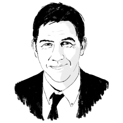
Chuck Close gives Photo-Realism a new twist. He uses color to craft a kind of riotous pointillism
| New York
It seems I've been proved wrong: Chuck Close has turned out to be an artist after all. I should have known better than to doubt it. After all, I had my reservations about him once before - in 1970, to be exact - and I was mistaken then as well. A friend had asked if he should buy a large Close painting he had just seen in an off-Madison Avenue gallery for $1,800, and I had said no. I thought Close's work represented a new fad that would soon blow away, and my friend would be wise to put his money elsewhere.
He took my advice - and now reminds me occasionally of the small fortune he failed to make as a result.
I haven't been too concerned, however, for my original assessment of Close's huge, Photo-Realist paintings of human heads seemed to be substantiated by every show of his I saw. Despite his growing reputation, I remained convinced that what he produced was more about discipline and technique than about art, and that, sooner or later, the art world would catch on.
What I saw recently, however, in an exhibition of his new work at the Pace Gallery here convinced me otherwise - not about what he's done in the past, but about what he's doing now and is capable of doing in the future.
On the surface, his approach hasn't changed much. He still works directly from photographs, establishes a rigid grid system over the entire canvas, and then proceeds to replicate the photo image by filling in each of the tiny squares of the grid with its matching tone or colors.
In the past, this led to such a perfect mimicry that viewers were convinced they were looking at huge, blown-up photographs. To heighten this effect, Close originally limited himself to a precisely controlled variety of grays - together with a few whites and blacks - and he often worked with both painting and photograph upside down so as to minimize the temptation to personalize the image.
More recently, he's taken to applying a daub of paint in each tiny square with his index finger, or to placing two conflicting or complementary colors side by side or slightly overlapping in these squares. Even so, this technique, although less rigid and purely photographic than before, still had the effect of merely enlarging the original snapshot.
But in the last three years, significant changes have taken place. Although still dramatically ``photographic,'' his portraits now also achieve an independent painterly existence, by standing on their own and doing more than fool the eye. Now, using the grid system for control, Close builds up, layer by layer, a succession of brilliantly hued dots and blips until both photographic ``accuracy'' and the desired color intensity are achieved.
It's a kind of riotous pointillism at close range that clicks into place and harmonizes when one steps back a bit from it.
The show consists of eight portraits of five subjects: artists Alex Katz, Lucas Samaras, Francesco Clemente, Cindy Sherman, and Close himself. Four of the canvases run to 8 by 7 feet, while the smallest (and in some ways the most successful) is a 36-by-30-inch geometrically structured coloristic explosion that turns out to be - at a distance of several feet - a study of the head of Lucas Samaras.
``Lucas II'' is impressive because it strikes a balance between dependence upon an exacting, preexisting model and total improvisational freedom. Each of the thousands of tiny squares that make up its grid is packed with two or more pulsating colors, chosen both to help replicate the photograph and to produce a number of rich coloristic effects. But there's more. To accentuate the iconic appearance of the work, the grid is tilted on a diagonal, and its many colorful daubs and smears are deployed in concentric circles whose hub is a point at dead center between Samaras's eyes.
Nothing could be simpler, more systematic - or more energizing. No matter at what distance one views it - 2 feet, 9 feet, or 30 - the image is alive and satisfying, both as a sumptuous painterly and coloristic effect and as a photographic likeness imaginatively translated.
And the same is true of everything else on view, with the possible exception of the Cindy Sherman portrait, whose independent existence as painting rather than as transposed photograph is a bit shaky.
``Francesco I,'' on the other hand, is totally successful. It not only achieves a synthesis of apparently contradictory elements (representationalism and abstraction, descriptive analysis of form and pure pattern); it is also a late 20th-century icon of considerable acuity and power. A black-and-white photograph of the painting cannot do it justice, since such an image does little more than reduce the painting back to its original state. Whatever is of value in this work lies in what Close has done to and with the original snapshot - and that, of course, has everything to do with color and scale.
Also outstanding are ``Lucas I'' and Close's 1987 ``Self-Portrait.'' Unfortunately, there's one bit of bad news: This excellent exhibition has already closed.


