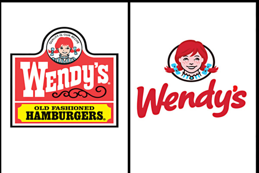
Wendy's logo gets a makeover. The pigtails stay.
Loading...
| New York
Wendy's pigtails are getting a tweak.
For the first time since 1983, the Dublin, Ohio-based fast food company is updating its logo in a move intended to signal its ongoing transformation into a higher-end hamburger chain.
Instead of the boxy, old-fashioned lettering against a red-and-yellow backdrop, the pared down new look features the chain's name in a casual red font against a clean white backdrop. An image of the smiling, cartoon girl in red pigtails floats above — though this girl looks more vivid and not quite as childlike.
In an interview with The Associated Press, CEO Emil Brolick said the current logo had served the company well for the past three decades, but that it was time for an update. Still, Brolick said he was encouraged by consumer feedback in testing dozens of new logo variations over the past several months.
"When we pushed things too far, they very much reeled us back," he said, noting that it showed just how attached people are to the brand.
It's only the fifth logo update since founder Dave Thomas opened the first Wendy's in 1969, and perhaps the most significant. The makeover comes as the chain known for its square burgers and chocolate Frosty shakes struggles to redefine itself in the face of intensifying competition from the likes of Panera Bread Co. and Chipotle Mexican Grill Inc., which are seen as a step up from traditional fast food.
Wendy's push has intensified since Brolick came on as CEO about a year ago. In addition to raising perceptions about its food, Brolick is focusing on renovating outdated restaurants with a look that features natural lighting, flat-screen TVs and a variety of seating options, including cushy chairs in nooks.
The idea is to create a more inviting atmosphere where consumers feel they can relax. Starting in March, Wendy's says the updated logo will start appearing on newly built and renovated restaurants.
It's still far from clear whether Wendy's broader reinvention will succeed. But sales at its restaurants open at least a year have edged up for the last five quarters. Craig Bahner, the company's chief marketing officer, notes that all brands need to evolve.
"It's a tangible signal of change," Bahner said.
The Wendy's name and original logo were inspired by founder Dave Thomas' daughter, whose real name is Melinda Lou (her siblings couldn't pronounce her name when they were younger, so they called her "Wenda," which turned into "Wendy").
Thomas thought the name conjured the image of the wholesome hamburger restaurant he dreamed of opening.
In his book "Dave's Way," Thomas recalls how the family dressed up Wendy, then 8 years old, in a blue-and-white striped dress for the opening of the first location. To make her pigtails stick out, they put pipe cleaners in her hair. That's roughly the image of the little freckle-faced girl in the logo.
In undertaking the redesign, the company realized there were three key elements that had to be preserved; the image of the little girl, the color red and the way the "Wendy's" font swerves up — what executives call "the wave."
In the new logo, Bahner notes that Wendy's pigtails peek out from the oval frame, bringing her forward and making her more dynamic. The logo will be part of the new restaurant design that Wendy's is looking to expand to its roughly 6,000 locations in North America.
Brolick has noted that the revamps "enhance all dimensions of the Wendy's experience" and that renovated locations see a 25 percent bump in sales. By 2015, Wendy's plans to have half its 1,425 company-owned locations updated.
Ultimately, Brolick wants the company to be seen as a "top-end" fast-food chain — better quality than McDonald's, but perhaps not at the same level as Panera.
"Our goal is to be a five-star restaurant at a three-star price," he said.
Building on the introduction of its sweet baked potato and Bacon Portabella Melt cheeseburger this year, the company is looking at introducing whole wheat buns and flatbreads. Brolick says those type of small adjustments can have a big impact on perceptions about the healthfulness and quality of the chain's food.
The changes are even extending to employee uniforms, which will be updated next year to have a more tailored look.
The early feedback is positive and Brolick says workers like them — so much so that they even feel comfortable wearing them outside the restaurant.


