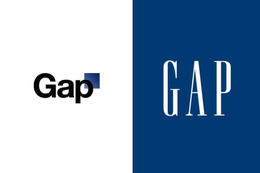
Gap logo changes: renaissance or mistake?
After keeping the same iconic logo for 20 years, Gap decided the time had come for change.
Why? Nobody knows. CEO Marka Hansen defended the change in an op-ed for The Huffington Post, but her defense reads like a marketing stump speech: uninspired. "We chose this design as it's more contemporary and current. It honors our heritage through the blue box while still taking it forward," she writes.
Contemporary? Sure. It's a nice round font – Helvetica, actually – that looks like it should be stamped on the side of a box with shiny high-tech toys like iPads or smartphones.
The company is willing to reconsider, Ms. Hansen adds. Fans who want to offer their own re-redesign are invited to "share their designs with us as well. We welcome the participation we've seen so far."
But the reaction has been overwhelmingly negative, so far. Gap's Facebook page (which still shows the old logo, splashed repeatedly across the site) already shows more than 1,000 responses to the change since the news was posted Wednesday evening. Although the announcement itself got 400 "Like" clicks, the comments run almost entirely against the new logo.
"Please consider going back to your old logo," writes Sally 'Richardson' Robbins on the Facebook page. "I am a long-time customer of Gap and a marketing professional. I love the timeless, classic designs that have made your brand great and your old logo completely conveys this image."
A minority of commenters also blasted the offer for fan input, denouncing it as a cheap stunt unworthy of a market leader.
"Crowdsourcing? Are you a multi-million dollar clothing chain or a used car lot?" asks Mike Oliver.
A fair amount of squawking is inevitable when something familiar suddenly changes. The real question is what the logo will look like a month from now.
Will Gap surrender to the shouting hordes and revert? Will it accept a fan's design? Or does the company have some milder redesign, already waiting in the wings, that it will offer up as a "compromise" to the crowds?
Gap's clothes – white cotton button-downs, crisp jeans, simple tank tops – have mass appeal as basic pieces around which many shoppers structure the rest of their wardrobes. Will their logo continue that tradition of timelessness, or is Gap hoping to use the new logo to redefine itself in the market?


