Addressing concerns about our new website
Loading...
On May 8, we launched our newest publication, The Christian Science Monitor Daily. On the same day, we significantly redesigned CSMonitor.com to feature the new Daily.
We are so pleased at the response to the Monitor Daily.
The website redesign was met with much less enthusiasm.
Readers have two basic concerns:
- They can no longer easily access Monitor content not in that day’s Daily edition.
- The home page is static and lacks relevance to the news of the day
We are working hard to fix these.
First, we’d like to tell you why this happened.
Why did we make these changes?
For about five years, the Monitor made the web page our core offering to readers. But like other media outlets, we found that this was not a sustainable strategy. Even when our web site got 12 million unique visitors a month, our home page generally got only about 5 percent of that total. We were not building a loyal audience.
That was not a formula for success.
So we are getting out of the “free news” business – offering our content to everyone for free and relying on digital advertising.
But what can we do instead?
The demand of today is for distinction. In a world awash in free information, news organizations have to make a strong case for why we are unique and worth financial support from you.
Also, readers want to have news “pushed” to them via Twitter, Facebook, text alerts, or email.
We hope the Monitor Daily addresses both those trends. It is pushed to where our readers are and offers this pact: We will deliver our distinctive view of the world and you support financially our ability to produce that news.
In that spirit, we dramatically changed CSMonitor.com to focus on the Monitor Daily. But we miscalculated on how much current subscribers – our most loyal and valued audience – utilized and enjoyed our website.
We want to be adding value for you, our subscribers, not removing it.
What are we doing about it?
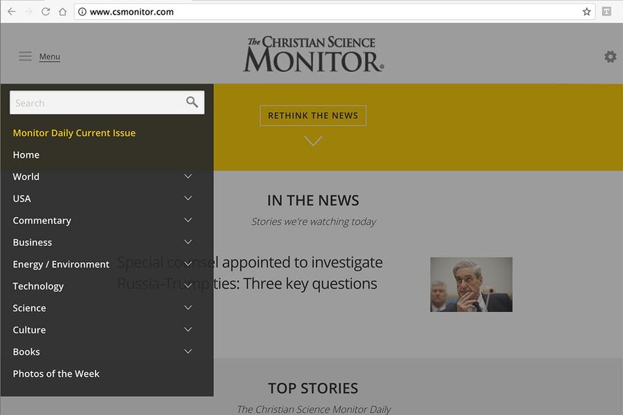
• In the short term, we have restored navigation to the home page to allow you to access all Monitor content. You can find this navigation bar by clicking on the three horizontal lines in the top left of the home page (see image above).
• We will soon reintroduce a sense of relevance to the news of the day by offering a new home page. The new site will be more elegant and streamlined than before.
If you want to stay updated on our progress, I’ll be blogging about it in my Upfront column, which you can find in the Commentary section of the website.
If you have any questions, please don’t hesitate to write me at editor@csmonitor.com. We are making these changes because of your feedback. We are eager to hear what you think and how else we can best serve you.


