What a new map tells us about the Milky Way
Loading...
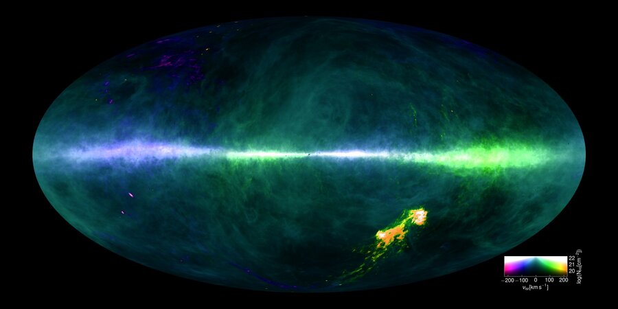
By charting the concentration of neutral hydrogen, the most abundant element in space, a team of international researchers have created a detailed survey of the Milky Way.
Combining 10 billion individual data points and thousands of hours of telescope observations at the Parkes Observatory in Australia and Effelsberg 100-m Radio Telescope in Germany, the HI4PI map shows concentration of stars in the Milky Way as well as the surrounding dwarf galaxies. The research, which began in 2006, was published Wednesday in the journal Astronomy and Astrophysics and has the potential to make future research about the Milky Way and even surrounding galaxies more accurate.
“We’ve been able to produce a whole-sky image that in many ways is greater than the sum of its parts,” Lister Staveley-Smith of the International Center of Radio Astronomy Research (ICRAR) told CNN. “The new map gives us a much more coherent view of the sky and enables a better understanding of the Milky Way."
The map consists of an animation that portrays the Milky Way, 180,000 light years long, on a plane the way one would see it from Earth.
"Each frame tells us how fast that gas is moving with respect to us [on Earth]," Naomi McClure-Griffiths, a professor at the Australian National University, told Mashable. "When the colors are brightest, that's where there's a lot of gas. When you can see the whole screen filled with bright colors, that's the [gas] that's closest to us."
The HI4PI survey improved on the previous hydrogen study, the Leiden-Argentine-Bonn (LAB) survey, by a factor of two in sensitivity and a factor of four in angular resolution. The resulting map was a much clearer and more accurate picture of the galaxy.
For example, the map was sensitive enough to pick up on very fine details of the clouds existing between the stars in our galaxy.
“Tiny clouds become visible that appear to have fueled star formation in the Milky Way for billions of years,” Staveley-Smith said in a statement. “These objects appear too dim and too small to be detected even in the other galaxies closest to us.”
The researchers hope that the new map will aid in understanding how structures within the Milky Way are formed and where the gas needed to fuel that formation comes from.
What made the data so accurate were the computer algorithms written by the researchers to clean out the radio noise pollution caused from mobile phones and broadcast stations that pollute the data.
“The data processing was an even greater task as we had to write our own software packages to carefully calibrate the data and subtract out spurious signals at each point in the sky,” Staveley-Smith told CNN.
However, with the radio noise cleared out of the picture, the research team was able to create a more accurate map of the Milky Way which, with the data available to scientists through the Strasbourg astronomical data center, will make exploration of the galaxy and beyond easier for future researchers.
“Like the clouds at the sky, all observations we receive from the distant Universe have to pass through hydrogen in our own Milky Way,” Benjamin Winkel from the Max Planck Institute for Radio Astronomy, said in a statement. “The HI4PI data allows us to correct accurately for these hydrogen clouds and clean the window we are watching through.”


