A few months ago, I decided to make the jump to Windows. I'd been using Macs exclusively since 1996, and while I had a passing familiarity with Windows XP from school and work, I'd never had a PC as my main machine. Now, after spending almost two months on an Acer TimelineX laptop running Windows 7 Home Premium, I've gotten a better sense of the relative strengths and weaknesses of the Mac and Windows operating systems. And I've learned some things that might help other people who are considering a switch.
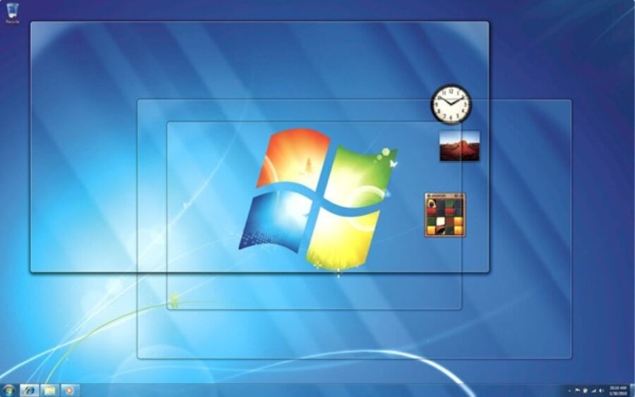
There are plenty of user-friendly flourishes built right into Windows 7, including attractive desktop widgets, file previews, assignable media keys, and the ability to quickly "snap" windows to full- or half-screen. During my very first day in Windows, I discovered that I could set a key combination to quickly launch programs I use frequently. (Those combinations can be set through the program's "Properties" pane.) I had a similar setup on my Mac, but a third-party program called Spark had to be running in the background. It was cool to see this feature baked right in to Windows.
My PC experience also dispelled some lingering ill will I'd had toward the Microsoft OS. When I'd used Windows XP before, I always felt that useful settings like monitor resolution and Bluetooth support were either buried deep inside nested menus or placed in locations where you would never think to look. By contrast, things are generally right where I expected them in Windows 7, and it's easy to get to often-used settings. I can change the desktop wallpaper in four clicks: right-click on the desktop, choose "Personalize," click "Desktop background," and make a selection.
Windows 7 also does a good job of letting me know when things are going on, without being intrusive. Automatic backups, for example, run quietly in the background after initial setup. There's no need to bring them to my attention while they're going on. But when a program needs special permission to install, Windows will by default dim the screen and request authorization so I can be sure nothing is installing itself in the background without my knowledge. The notification system strikes me as thoughtful and responsible, without being intrusive.
My Windows experiment has shown me that a lot of the principles of good user interface design are consistent: many elements of window management and application launching are generally the same across the Mac and PC platforms, which certainly eases my transition from the one to the other.


