Twitter redesign takes a page from Facebook
Loading...
Twitter is rolling out an entirely redesigned webpage, but if you’re a Facebook user, it will look strikingly familiar.
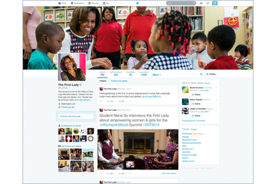
Twitter announced a profile redesign on its blog Tuesday that will roll out to all of Twitter’s users in the coming weeks. The redesign includes a banner with a customizable photo option on top, similar to Facebook’s recently launched cover photo feature. It will also hinge more heavily on the social impact of each tweet, allowing users to “pin” one tweet to the top of their profile and feature bigger fonts on tweets that garner more social interaction.
“Moment by moment, your Twitter profile shows the world who you are,” Twitter says on its blog announcing the change. “Starting today, it will be even easier (and, we think, more fun) to express yourself through a new and improved web profile.”
Here is what has changed. A banner photo takes up the upper third of the screen while profile pictures and the “about me” section has been moved to the right side of the screen. A horizontal navigation bar lets users toggle between tweets, photos/videos, following, followers, and lists. Users can also choose whether they want to view just tweets, tweets with photo/video, or tweets and replies. The “Who to follow” bar and trending topics flank the right side of the timeline while a users’ followers, photos, and videos are on the left. Twitter didn’t mention if the primary stream of tweets would look any different after the redesign.
Timelines will no longer be just a chronological stream of 140 character messages. Users can choose one tweet to feature or “pin” on the top of their feed, “so it’s easy for your followers to see what you’re all about,” says Twitter. Tweets with more engagement will appear larger on timelines.
So far, the change has only been rolled out to a select group of users, including First Lady Michelle Obama, actress Kerry Washington, and musician John Legend, among others. New users will start with the new profile design.
The profiles that Twitter has featured with the change are public figures, which make it difficult to predict what the changes will look like for average users. @ZacEfron pinned a tweet about his new film at the top of his feed and @weezer featured one from their latest music video shoot, both for obvious promotional benefit. The same goes for journalist @CaseyNewton, who pinned a recent article he wrote on Mozilla's CEO. It isn’t clear what the average tweeter would use this space for, other than an extended “about me” section.
The response on Twitter was mixed, with many commenting on the striking similarity to Facebook’s layout. Others say the new design provides more room for individuality: “Take advantage of updates #digitalidentity,” tweeted Macalester College’s Career Development Center in Saint Paul, Minn..
Though it appears Twitter is taking a page from Facebook’s aesthetic, in the not-too-distant past many were commenting on how Facebook was taking a page from Twitter’s public presence and user-generated buzz with its more public privacy settings and the addition of clickable hashtags.
This is the second time this week Twitter has made headlines. On Monday, the company announced it had bought lockscreen app Cover for an undisclosed sum, likely to develop a Twitter-centric home screen for smart phones.


