Apple's 'natural scrolling' feels horribly unnatural. Here's why.
I was really excited to take the virtual gift wrap off of Mac OS X Lion when I downloaded it last night.
The "app" finished downloading from the Mac App Store, installed seamlessly, and popped me right back into the Mac OS X I know and love.
Except one huge glaring thing is different: scrolling is backwards.
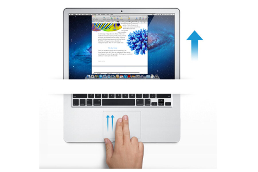
In Lion, when you take two fingers and move them up on your MacBook's trackpad, the content moves up with it.
If you don't yet have Lion, move your two fingers up to scroll right now, and see which way your content goes. Same for you Windows people out there. It goes down, and that's the way it's been for a decade.
We all knew this was coming. Apple big wigs have been touting natural scrolling as the "right way" to be doing scrolling, but then why didn't they do it that way in the first place?
They didn't do it in the first place for one simple reason: scroll wheels on mice came first. When you scroll down on a mouse's scroll wheel, content moves up on the page. Using scroll wheels on mice for years has trained us to use the "down motion" with our fingers to indicate that we want our content to move upwards and off the screen.
When Apple invented two-finger scrolling, they followed this convention.
On an iPhone or iPad, natural scrolling works because you are touching the screen and watching the content move under your fingers. Like sliding a piece of paper across a desk, you can move content on a web page in Mobile Safari.
If stuff would move the opposite direction, it would feel ridiculous, because you're actually touching it.
Apple thought they'd bake this same scrolling motion into Mac OS X Lion, but they're just plain wrong. Because your computer screen is on a completely different three-dimensional axis as the surface you're touching, "natural scrolling" is jarring.
I feel like I'm in the movie Inception and I'm trying to walk up a wall in front of me.
I did an experiment by tilting my laptop screen as far back as possible. Once I did that, "natural scrolling" felt more natural. Once your screen is on the same plane as the surface you're sliding your two fingers across, it works.
But because your screen is oriented almost perpendicularly to the trackpad, it doesn't work. It works when you're touching the actual content (like on an iPhone or iPad), but not if your hands are manipulating a space that doesn't mentally signify what's happening on another plane.
The one way natural scrolling does feel right is when you're switching between "spaces." Swipe to the right using three fingers, and the space you're in slides off the right side of the screen, almost as if you were pushing aside a branch blocking your path.
Swipe three fingers to the left, and the opposite happens.
So, natural scrolling is logical, but can we re-train our brains to get used to it while we're trying to scroll vertically? I felt helpless as I tried to adjust, and I'm a young guy with a pliable mind. I'm not stubborn.
Using Tweetdeck and multiple columns with natural scrolling was scary, because both horizontal and vertical scrolling have been flipped.
I feel like a technophobe for the first time in my entire life.
I'm conflicted because part of me wants to stay productive using the tools I know, while the other part wants to adapt--or just try this new thing.
So I turned off natural scrolling and all was well. I was comfortable again. Until I tried moving through spaces.
Now swiping through spaces is backwards.


