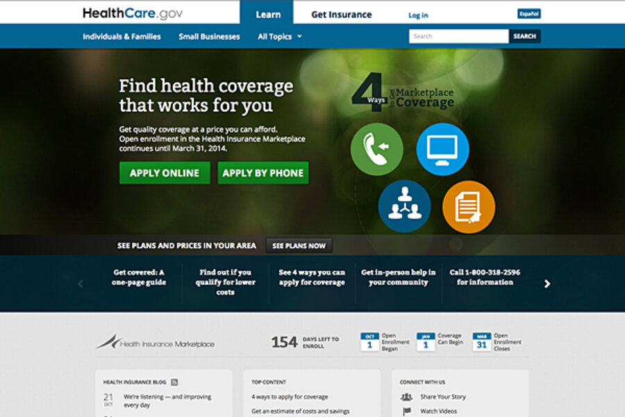
Obamacare fiasco: Was building HealthCare.gov really that hard?
Loading...
Technical glitches on the website to sign up for insurance under the Affordable Care Act have elicited no small amount of finger-pointing. But how tough a task is it to build an online portal like HealthCare.gov?
On the surface, it may look like just another shopping site. But tech analysts say it is a daunting mix of public and private databases combined with a nearly unprecedented demand for real-time secure information – all launched in the glare of national politics.
“What makes so much of this unique is the need for real-time validation for so much data,” says Edward Holden, associate professor of technology at Rochester Institute of Technology in New York.
For instance, the need for income verification “means they have to access antiquated systems over at the Internal Revenue Service, and they want it all to be done in real time,” says Professor Holden.
Most companies faced with such a demand would take the information and do the verification process off-line and get back in followup communications.
“What makes this extremely challenging is they are going into data systems that are not designed to be this responsive nor have the capacity to provide this kind of information quickly,” he says.
The big challenge for HealthCare.gov is pulling in all of those sources of data for hundreds of millions of people and layering it in a way that is flexible and manageable, says Sid Probstein, chief technology officer at Attivio, a software company in Newton, Mass., that specializes in "big data" management. “A project of this scale with huge data silos using legacy technology, will undoubtedly come with issues,” he adds in an e-mail.
Many large corporations launching sites on a similar scale have had certain advantages, says Mr. Probstein. “They can beta test, start small, reengineer, and work up to the massive size of HealthCare.gov,” he adds.
Inefficiency is one of the site’s biggest challenges, says Michael Smith, engineering vice president at Compuware APM, which has conducted a technical analysis of the HealthCare.gov site. This is predictable given the diversity of information sources – from individual states to the IRS to dozens of private insurers – and the fact that the site must work with nearly 50 different subcontractors to pull together its web of data, he says.
The site includes multiple versions of overlapping monitoring software, Mr. Smith notes. These programs track users' keystrokes and help the site deliver faster service based on the way clients actually use it. But HealthCare.gov has no fewer than five such programs, including Google Analytics, Chartbeat, and Pingdom, and they all do similar monitoring and feedback.
That suggests that each contractor built its own monitoring service into its calculations, he says. On one hand, that's “a good thing, because the monitoring helps them improve services." But, he adds, “the overall site could easily reduce that to one service.”
Each service requires the site to connect and provide information, creating an unnecessary drag on performance.
Many critics note that the site short-changed testing that might have picked out these flaws. But testing is no easy thing, says David Miller, chief security officer for Covisint, which specializes in "cloud"-based information management, who has testified before the US Senate on similar technology.
Say that a site has 16 "yes" or "no" questions. Answers to those questions produce some 65,000 pathways, “all of which have to be tested ... not just the 3,000 logical answers, because people are not always logical when they answer questions,” Mr. Miller says.
So why doesn't an enormously complex website like Amazon have such technical problems?
“Amazon has had 10 years to slowly build out its operations,” says Zach Nies, chief technologist for Rally Software, a software analysis firm.
The key to constructing a massive site is to tackle small sections at a time, test them, and build on the lessons of each small segment, he says.
Along those lines, HealthCare.gov is improving daily, Smith says. Compuware has been tracking the site since the firm conducted its Oct. 21 analysis. As of last week, 26 states had average wait times of more than eight seconds, which he deems “unacceptable.” As of Oct. 29, that number had dropped to 15.


