MIT project turns your inbox into an infographic
Researchers at MIT's Media Lab use e-mail metadata to create infographics of users' correspondences.

The Immersion data visualization project creates a web of e-mail interactions using metadata.
Immersion screenshot
There is a saying: Show me a man’s friends, and I will show you the man. A recent project at the Massachusetts Institute of Technology’s Digital Media Lab takes a new spin on this adage: Show me a man’s metadata, and I will show you the man.
Two master’s students at MIT devised a computer program that allows users to see a “visual inbox” using scraps of information from their e-mail accounts.
Nearly a year before leaks about the National Security Agency’s data collection and surveillance program were splashed across the front pages, two students at MIT began working on a project with their advisor that shows the wealth of information that can be pieced together from metadata.
Cesar Hidalgo, a professor at MIT’s Media Lab, had wanted to create an infographic using metadata from e-mail addresses, but never had an opportunity to work on the project. Last September, Mr. Hidalgo decided to turn over the idea to two of his students: Daniel Smilkov and Deepak Jagdish. Mr. Smilkov had a strong background in math and analytics, and Mr. Jagdish brought in several years of art and design experience, writes Hidalgo in a blog entry about the project’s conception.
Throughout the fall semester, the pair crafted a computer program that could sweep through an e-mail account in a matter of minutes and create a visual representation of the account’s correspondences.
The “Immersion” project runs from a website that uses a technology called OAuth to securely access a user's Gmail account information. Neither the e-mail address, nor the password is visible to Immersion because of the security behind the log-in page.
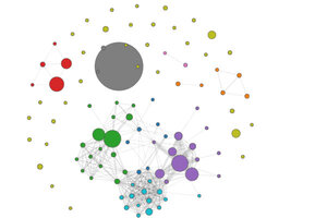
Using metadata – the “from,” “to,” “Cc,” and timestamp of e-mails – Immersion creates an infographic of the account’s correspondences.
In about a minute, circles and dots – some interconnected and some floating by themselves – appear on the screen. Each circle is representative of a person, and has a name at the bottom of the screen. The larger the circle, the more e-mails exchanged with that person. Lines connect different e-mail accounts, and people in the same e-mail web have the same colored dots. The colors of the dots are randomly generated.
On the right-hand side of the website, there are graphs of e-mails sent, received, and the number of new collaborators. There is also an option to view "top collaborators" within different time ranges. A time-slider at the bottom of the screen lets users slide through their e-mail accounts to watch as circles shrink, grow, emerge and disappear.
To test Immersion, Jagdish, Smilkov, and Hidalgo set up a small exhibit in MIT’s Media Lab lobby and presented the system in April. “It was...then that we started to realize the emotional reactions that Immersion was able to generate,” writes Hidalgo. Even the bare bones of e-mail correspondences (the metadata) created a kind of “social nudity,” exposing webs of interactions.
“It was moving,” says Jagdish in an interview with the Monitor. For him, the time-slider was the most important part of the experiment. Jagdish was cursorily aware of with whom he keeps in touch, but he says, until he used Immersion, it was hard to really conceptualize how his patterns of correspondence have changed over the years. Jagdish’s group of friends began joking about who ranked highest on the list of collaborators, and how big each others dots were, to determine who was closest to whom.
Smilkov had similar experiences after the site launched. With Immersion, users are “likely to see ... old relationships in a different mindset,” he says. Both Smilov and Jagidsh got back into touch with old acquaintances who appeared on their webs.
When the project debuted at the end of June, the website received so much traffic that it crashed within several days. After the sites re-launch on July 4, it received 60,000 visits the next day.
While the infographic is a demonstration of patterns in e-mail interactions, it is also a testament to just how much information is available from metadata.
“For the press, [Immersion] was the tool that allowed you to Prism yourself,” writes Hidalgo. “Immersion made a dent in the discussion of the government’s use of metadata, and has given a new meaning to the ‘it’s just metadata’ argument voiced by governments.”
Smilkov and Jagidsh’s project allows users to erase all of their metadata from the MIT servers, and the website states that the researchers do not access other parts of your e-mail accounts. The data collected is “zero information, just interaction,” says Smilkov.

