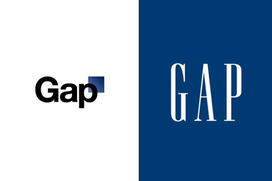
New Gap logo withdrawn: The 'blue box' lives on
Power to the fans!
In a remarkable testament to the power of social networks, Gap withdrew its proposed redesign after Gap customers and online fans slammed the new Gap logo — as clearly and rapidly as only the Internet makes possible. More than a thousand negative comments had been posted to Gap's Facebook site, and @Gaplogo had its own Twitter stream to lambaste the fashion giant for daring to change the iconic "blue box" logo.
The online outpouring worked. Just one week after Gap introduced its Helvetica-round logo, it rescinded it with an online mea culpa.
“Since we rolled out an updated version of our logo last week on our website, we’ve seen an outpouring of comments from customers and the online community in support of the iconic blue box logo," said the statement from Marka Hansen, president of Gap in North America. "All roads were leading us back to the blue box, so we’ve made the decision not to use the new logo on gap.com any further."
Ms. Hansen managed to avoid mentioning Facebook or Twitter by name, but did refer to "the online community" and added that she and her staff had "been listening to and watching all of the comments this past week." Gap handled the removal of the logo with increased Facebook aplomb. Last week, the logo changed on gap.com without fanfare, and was defended on Facebook two days later. This time, the announcement was made directly on the social network.
Hansen also reminded fans that the blue box turns red for the seasonal campaign, either to forestall angry complaints in a month or two or to begin the holiday buzz early.
Most of the new online chatter celebrated the return to the classic logo. By Tuesday afternoon, almost 2,000 people had clicked that they "like" Hansen's announcement of the logo's withdrawal. "Thank GOODNESS! The new one was just absolutely HORRID! (>_<)," commented Leslie Arambulo.
Other comments speculated about marketing motives behind this tempest on the Twitter feed. A dozen denounced it as a publicity stunt, while others speculated that the Gap had been hoping for a crowdsourced logo but chickened out.
Mike Czuboka wrote, "A company as large as The Gap doesn't launch a brand new logo by just slapping it up in one place on their website. If this had been a genuine logo redesign it would have been introduced much more consistently across a wide variety of mediums."
"Looks like whatever you guys did, worked," wrote Kym Zwick. "Whether positive, or negative, it got people talking about Gap again... I'm willing to bet sales will skyrocket today. Marketing is a funny little thing isn't it??"
A few comments announced that customers are planning to run to Gap and buy something today in celebration, so Ms. Zwick may be onto something.
It now appears that Gap will use its classic logo for the foreseeable future. Gap executives also acknowledged they'd learned an object lesson in the role and power of social networking media. "We recognize that we missed the opportunity to engage with the online community," wrote Hansen.
“There may be a time to evolve our logo, but if and when that time comes, we’ll handle it in a different way," she concluded. Marketing students, pay attention: If Gap did indeed learn its lesson or orchestrated this online furor, its next redesign attempt should be a social marketing masterpiece.


