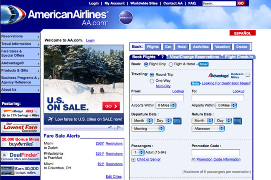
The website design expert’s opinion on the major airline’s homepage is blunt:
“It looks like a government form. Believe it or not, American Airlines’ site stresses me out just by looking at it,” says Gabriel Shaoolian, CEO of Blue Fountain Media, a website design company with clients such as Nike, United Nations, and Harper Collins Publishers. “It looks like it was created 15 years ago.”
The airline’s static homepage comes off even worse once compared to those of its competitors, JetBlue.com or United.com for example. Both have more relaxed designs – less clutter and easier on the eyes color schemes.
Planning a flight can already be a harrowing experience. Add to that an unappealing interface and users may subconsciously avoid purchasing from American Airlines.
It goes without saying that websites aren’t just a fun side project for companies anymore.
“They’re visibility, packaging,” says Shaoolian. “It’s a very key component to a user’s engagement and their brand loyalty.”
Frequent international travelers may be aware that American Airlines isn’t the worst of all. Low-cost, no-frills European air carrier RyanAir.com takes the prize for ugliest airline website. Buyers might be willing to spend a few more euro to avoid its baffling homepage, with quick flashing bold text boxes on the left, right, and center of the screen.


