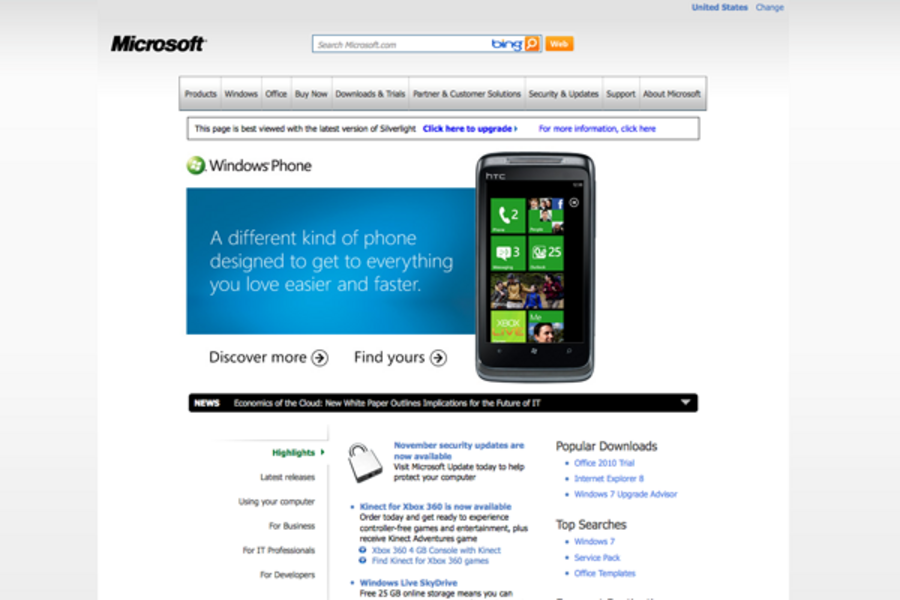
Ugly is in the eye of the beholder, and by no means does plain equal unappealing (just look at Google). But coming from a multibillion-dollar technology corporation, Microsoft’s surprisingly vanilla website is borderline hypocritical, says Shaoolian.
Its homepage lacks the interactive "Web 2.0" feel, he says.
“Microsoft looks like it was made by developers, for developers,” he explains. “There’s no attention to aesthetic detail.”
The company’s site looks especially backward when compared to their chief competitor, Apple.com. The two sites share a black-and-gray color scheme, but that’s about it.
“Apple’s site is user-friendly. It’s not overcrowded,” says Shaoolian. “It talks to you as a user. It answers your questions and has big text.”
The lackluster visual effects on Microsoft’s homepage don’t inspire thoughts of cutting edge innovation. Shaoolian warns that it could deter those potential customers grappling over the Mac versus PC debate. So why doesn’t Microsoft redesign their website?
“Part of the problem is that these huge companies are slow to move on things,” says Shaoolian. “There’s a long bureaucratic line to get things done. But it does hurt their bottom line.”
Microsoft's new phones get it. Why doesn't its homepage?


