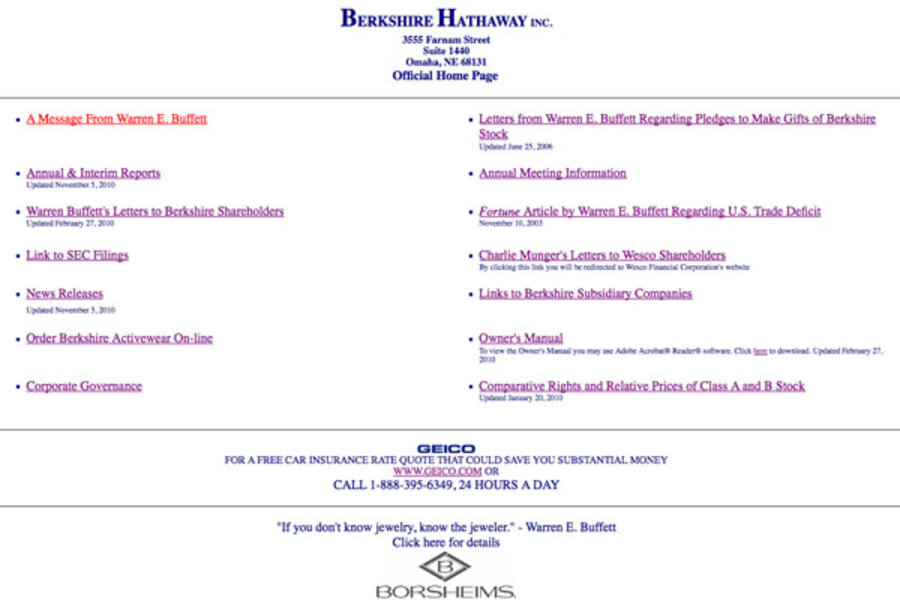
Warren Buffet’s mega successful conglomerate Berkshire Hathaway trades the most expensive NYSE stock in the world. Its subsidiaries include Business Wire, GEICO, Helzberg Diamonds, and dozens of other companies. But money doesn’t necessarily breed beautiful, or even passable, websites.
Berkshire Hathaway’s website is oddly simplistic with a title, a few bullets points, and a couple of plain text advertisements for their subsidiaries. There are no graphics or videos, no pull down toolbar, no call to action.
“There’s no personal branding. There’s no way for me to send information to my friends who are investors,” says Shaoolian. “A simple little thing like a social marketing feature would help tremendously.”
Is the Fortune 500 company trying to make a statement, that they don’t need a well designed website to be successful in the market?
“They’re saying, ‘We’re Berkshire Hathaway, you know us. We don’t have to prove anything to you. You’re going to make the extra effort to move forward,’ ” Shaoolian says. “That kind of ego fails them, just like it does Microsoft.”
Sure, the company has proved itself wildly profitable already. But what CEO would turn down more?

berkshirehathaway.com
Berkshire Hathaway's no-frill, no-nothing website.


